Thursday, October 10, 2013

Post #120: Personal Style - Fall Accessorizing Fun!

Put your riding boots on, because this blogger is back in action! And what better season to start off in than the fall. As the leaves start swiftly falling off the trees here in Hamilton, New York and the temperature begins to edge into sweater territory, there are so many great opportunities for fashion! This week, my personal post is about how to keep it simple...but stylish.

Upon stepping into my closet, I got the sudden (and rare) urge to throw on a button down with a pair of jeans. But, a little voice in the back of my head wouldn't let me deviate too much from my slightly more eclectic signature style. The solution? Accessories! Three statement rings added subtle flair while a lightly patterned jewel toned scarf was the perfect addition for when I wanted to transition from crisp and proper to cozy as the day progressed.

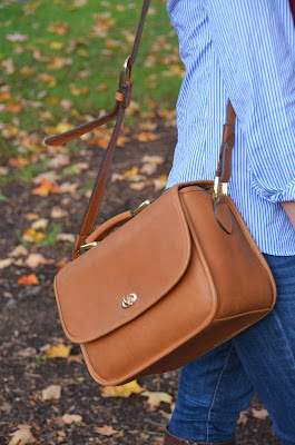
The leather Ona "La Palma" camera bag was the perfect way to finish off this bohemian infused Ivy look.


Shirt: J. Crew, Scarf: Forever 21, Rings (left): Forever 21, Ring (right): Urban Outfitters, Camera Bag: Ona, Boots: Enzo Angiolini, Jeggings: American Eagle Outfitters.

Friday, June 28, 2013

She & Him Video Contest

So this is definitely a bit of self-promotion, especially since I haven't blogged in a while, but I did style myself à la Zooey Deschanel for my She & Him "I Could've Been Your Girl" music video contest entry. Check it out!


Monday, January 28, 2013

Post #119: Worst Dressed at the SAG Awards

For as much as the red carpet at the Golden Globes continuously impressed me this year, the one for the Screen Actors Guild Awards made me grimace and cringe. Someone let Lea Michele and Mad Men's Teyonah Parris dress for the senior prom in shiny cheap-looking fabrics. Jane Lynch showed up in a David Meister gown that screamed bondage and Xena more than age-appropriate and flattering. Rose Byrne's flowy concoction made me think of grandma's curtains. And amidst all of the mess, a select few stood out. So, this time around I give you not the Top Five, but the Top Six worst dressed of the night.

6. Sofia Vergara: At the Golden Globes Miss Vergara was sequined and oh so va va voom. Last night's appearance in Donna Karan made me imagine Marilyn Monroe coming into contact with the two evil stepsisters from Cinderella before the ball.


5. Julianna Margulies: Many a starlet tried for color-blocking in black and white...and this one was a swing and a miss. The skirt appeared heavy and sack-like and the waistline fails to flatter. And while I wish I could give her credit for pairing those shoes with this Chado Ralph Rucci gown, I wish she had made a more demure choice instead.


4. January Jones: I can't quite tell what this dress is going for. Between the asymmetrical draping and the high (in the words of a friend: "lobster bib") collar, Miss Jones has missed the mark in this Prabal Gurung number. Can't she just go back to looking vintage Grace Kelly chic à la Mad Men?


3. Anne Hathaway: Frumpy, frumpy, frumpy. So far Anne Hathaway is 0 for 2 with red carpet winners this season. On someone else, I might say that this Giambattista Valli gown is playful and fun. But for Anne's body type it is all wrong. First, the shoulders make her look broad, then it doesn't come in at the waist enough before tutu-ing out of control. And the sheerness of the front is more kitsch than class.  Can we please go back to her looks from last year?


2. Morena Baccarin: This Basil Soda dress looks like it's been dragged around one too many times. Or as if it belonged to a mermaid who's been swimming in some pretty dirty water. While I love the bodice and how it flatters Baccarin's figure, the skirt (especially with the center slit) is all wrong.


1. Julianne Moore: You would think that after Michelle Williams and Sienna Miller people would stop trying the flower dresses. Somehow, they always fail. And Julianne Moore's Chanel Couture dress lives up to this poor reputation. Perhaps it would not have been so bad had the tailored body conscious skirt (with full flowers) continued up to the bodice and ended as a strapless masterpiece. However, the shoulder straps and chest area seem roughly thrown together. Does anyone think this looks like it fits?


Agree? Disagree? Let us know and COMMENT!

Sunday, January 13, 2013

Post #118: Jennifer Lawrence at the Golden Globes

 
Image Citation                                                                                      Image Citation


Gorgeous from the front. Gorgeous from the back. But then there's the side view...

Jennifer Lawrence in Christian Dior Haute Couture. Discuss. 

Post #117: Golden Globes 2013 Worst Dressed

          It happens every year and it happened again. The mighty rose and the unfortunate fell. While I loved most of the wide plunging necklines on the runway, I hated the awkward just-above-the-ankle/not-quite-tea-length skirts that kept showing up. For some, like Anne Hathaway, I questioned whether they looked at how boxy dresses could affect a midriff. For others, like Rachel Weisz, only sheer beauty could combat a sheer polka dot-bottomed affair. Yet others (we'll get to you later, Jennifer Lawrence) still leave me struggling.
          But for now, The Mannequin presents the Red Carpet Bottom Five:

5. Kelly Osbourne: The girl can pull off purple hair (love it!), but unfortunately this alien gray/green Zac Posen gown missed the mark. The deconstructed feel made for an unflattered torso and a less than polished look. 


4. Jessica Chastain: Seafoam waves could've made this red-head a gorgeously modern little mermaid...but her Calvin Klein gown just gave her a wrinkly and drooping chest.


3. Giuliana Rancic: This black and nude lace Celia Kritharioti combo screamed antique funeral. I wish that Giuliana would skip the high black necklines for once, as they only serve to make this gorgeous woman look severe. 


2. Emily Mortimer: To take a line from Sassy Gay Friend: What, what, WHAT are you doing? This space age silver turtle neck managed to be both unfortunate and frumpy. 


1. Sienna Miller: The normally fashionable Ms. Miller apparently did not learn from last year's Michelle Williams Valentino daisy dress mistake. The two-piece Erdem ensemble was a huge floral DON'T. The top's construction gave the beautiful actress boxy shoulders and while the skirt hugged her curves, the stick-out flowers were more than a little arts and craftsy.


Disagree? Agree wholeheartedly? Have an opinion? Comment!

Post #116: The Best of the Golden Globes

I'm more than pleased to say it, but this year it seemed like there were many more DOs than DON'Ts on the Golden Globe Red Carpet and stage. From our stunning hosts to ladies in red and stunners in black, I couldn't help but applaud actresses and stylists alike.
In honor of these fashionable ladies, I present you with The Mannequin's Golden Globes 2013 Top Five in their very own post:

5. Marion Cotillard: One of the great things about the Globes is that they give actresses some wiggle room to have a little fun. Cotillard took this cue and stood out by going short. It took me a few looks to get used to the asymmetrical draping of her Christian Dior by Raf Simons dress, but then I was sure that she just looked red hot.


4. Tina Fey: While I wasn't the biggest fan of Tina Fey's awkwardly tea-length red carpet gown, I couldn't help but think she looked fabulous when she stepped out on the Golden Globe stage. The hair style and color were perfect. Her body looked amazing. And that blue dress was slinky fabulous. The only thing I can't find online? Who it's by! Not to mention a lack of pictures...


3. Lucy Liu: Who knew that matte floral print could rock the red carpet boat so well? Another gown that took a few looks, Liu's blue Carolina Herrera number was silently stunning.


2. Julianne Hough: Rock of Ages? Try Rock CHIC. Hough was a punk princess tonight in Monique Lhuillier. Harsher metallic pieces fell into dreamy layers of tulle in this white and gold gown. What made it even more special though were her accessories: a gold Ferragamo clutch, a very "natural" ear cuff, and a perfect updo.

 
Image Citation                                                                     Image Citation


1. Kate Hudson: Hudson was simple and stunning in her black and gold Alexander McQueen dress. While I think it looked even better live, the picture speaks for itself.


Have an opinion? Think someone else deserves to be on the list? Comment!

Monday, January 7, 2013

Post #115: Up in the Air

Burberry's all film noir, Guess is looking "innocent" for once, and Chanel's a darker Marie Antoinette...

And I'm one of those people who absolutely loves looking at the plethora of ads that starts off every magazine I pick up.  

That being said, upon beginning my front-to-back read of the December/January 2013 issue of Harper's Bazaar, I couldn't help but notice that more than one design house was hit with the "travel ad bug." Based on the seasonal urge to beat the winter blues, the general concept is unsurprising. But this blogger was pretty shocked to see two ads that were more than a little similar. 

Louis Vuitton's L'Invitation au Voyage campaign has dazzled me since I first saw it almost two months ago. The fashion film, starring Arizona Muse, was directed by Inez van Lamsweerde and Vinoodh Matadin and unexpectedly set to a tune from 28 Days Later (who knew horror flicks could offer perfect fashion soundtracks?). The print ads use an image of Muse with her Louis Vuitton bag in a hot air balloon. 

After seeing Vuitton within the first few pages, I was shocked to flip a little further and find another hot air balloon. This one belonged to Carolina Herrera's CH ad campaign. While the differences between the ads include a couple and a purse-studded basket, I personally found the similarities a little too close for stand-out-potential comfort. 

From Louis Vuitton:


From Carolina Herrera:


What do you think?

Monday, December 31, 2012

Post #114: A New Year's Resolution

Let's face it, when it comes to most people's closets, there's the stuff that you reach for all the time. There's the stuff that you reach for sometimes (every so often, on special occasions, etc.). And then there's the stuff that you try to avoid reaching for. And hey, it's ok. Every closet needs its rejects...especially if there isn't a world of Narnian space inside that wardrobe.

So how do we go along with the whole "new year, new you" phenomenon while not losing our closet-focused minds?

In the past, I've always gone for the grand gesture. I make a billion resolutions without really writing them down. Somewhere in that mix the "Grand Closet Overhaul" rears its organizational head.

It normally takes a few weeks, during which time my bedroom becomes my new closet with piles of clothing big enough to jump into scattered around. Then I carefully put everything back in my closet, switch around my shelves, and somehow (almost) the same amount of stuff fits back in perfectly.

I always say that I'm going to get rid of/donate a bunch of stuff, but parting with even those reject pile pieces can be difficult. So this year, in an effort to really change, I'm taking a new approach to my closet.

Although I claim to have "actress style," meaning I like dressing for different "roles" à la Confessions of a Teenage Drama Queen (remember those good old days?), I am still going to make a concerted effort to reduce the amount of clothing I AVOID in my closet. The trick this year is this: instead of doing it all in one fail swoop, I'll go through my closet every couple of days in an effort to pair it down.

If I haven't worn it in forever: it GOES.

If I wore it in eighth grade and it's not a basic or from a special event: it GOES.

If I can't remember why I bought it and really hate it: it (sadly for my wallet) GOES.

If I won't wear it now and can't make it into something new: it GOES.

I know, I know. I'm being strict. And quite frankly when it's my closet instead of someone else's, each discard is a lot harder. Yet that's what doing it in little sessions is for...and at age 20, I feel like I should start making a more concerted effort to cultivate my personal (and future appropriate) wardrobe.

Wednesday, June 27, 2012

Wish List - Jefferson Hack

After seeing him outside of the Mugler show and then again after the Raf Simons show, I got up the gumption to introduce myself to Jefferson Hack. It was an absolute dream come true to be able to shake his hand and tell him how much I love his work. And as a fashionable detail, Hack was wearing skinny jeans, sunglasses, and a gray loose-fitting jacket. 

Blogger Hits Paris Men's Fashion Week - Raf Simons

            Confidence having risen after attending the Christian Lacroix show, this blogger attempted to get into the Raf Simons show...and did. 
            With all of the hype surrounding Simons as the new artistic director of Dior, this was definitely a show to see. Located in an industrial space on Rue de Lappe, the show's setting was edgy and gave off a feeling of great importance. The strong white and black interior had seating on two levels. Once it began, each model's trajectory started on the balcony level and then moved down to the main floor where intricate choreography allowed the models to avoid running into each other. 
            If anything, this show demonstrated the genius of Simons when it comes to taking a classic piece and making it new again. With eyelet-detailed jackets, striking prints that you would not expect to see on a man, and a colorful use of shirt facing, this show produced one marvel after another. Overall, it had a grungy yet playful schoolboy vibe that was even present in the models' hairstyles. 
            Based on what I saw here, I believe that Simons will take Dior in a new direction, but definitely live up to its legacy. And because fashion is all about the look, some photographs for your knowledge and entertainment (click to enlarge):

A view of the space as the first model traveled along the balcony. 


The collars on the button-downs and the cut of the suit jackets were two of my favorite aspects of the collection. Also, note the hair here. 


A definitive view of that schoolboy vibe. 


Note the blue facing in certain sections of the shirt. 


An eyelet style jacket. 


A print I would never imagine seeing on a man...but it works here. 


This coat was the piece de resistance of the collection. While not fully evident here, the back involved a floral printed fabric that appeared to be pleated. The contrast of the two sides stuck in my mind well after the show was over.


A shot of the final line-up. Note the use of (more feminine) color. 

(All photographs by Kristen Friberger)